UI Challenge #2 - Slider
Research
1. Rooms Slider

- PurposeA slider for users to choose their desired quantity of rooms
- Function Allow users to easily choose how many quantity they want
- Coherent The text constantly shows the changes of quantity when users move the slider
- Ease of Use The slider is easy to use, users just need to move the slider according to their own choice
- Enjoyable The animation of house changes depends on the slider. If the number of rooms are higher, the house becomes bigger. If the number of rooms are smaller, the house becomes smaller.
- Visual aesthetic & communication The design style is illustrative and catches users eyes. The animation makes it even more aesthetic with the style.
- Interactivity When users move the slider, the text will show the number of rooms based on the placement of the slider. Users are free to move the slider to their liking while enjoying the animation.
- Usability and engagement
The use of illustrations allows users to be more interested on using the slider. The animation also make users to feel fun while using it. The slider is user-friendly with most of the age groups.
2. Rating Slider
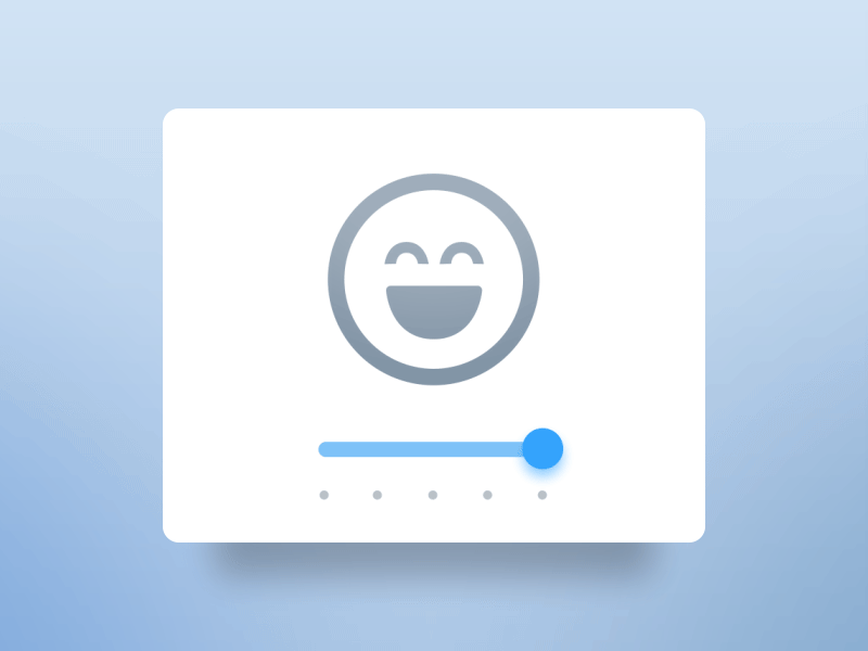
- PurposeA slider to rate users mood or feelings
- Function Allow users to choose their mood or feelings using slider
- Coherent Icons used are icons of faces ranged from sad to happy. Users are easy to recognize the icons as feelings or moods
- Ease of Use The slider is easy to use, users just need to move the slider according to their own feelings or moods
- Enjoyable The animation of the face icon warps to a different expression, which gives a smooth transition when users move the slider.
- Visual aesthetic & communication The design style is minimalist, it is simple and clean. The color used for slider is blue, to show contrast between the icon and then slider.
- Interactivity When users move the slider, the face expression changes according to the slider position. Users can try to move the slider to see all the expressions, and then choose which expression describe their feelings or mood at the time
- Usability and engagement
Users just need to move the slider to see the face expression. This slider might be hard to understand for older generations as there is no texts.
3. Quantity Slider

- PurposeFor users to select quantity
- Function Allow users to click or move the slider to select quantity
- Coherent Colors used are only two, which is only black and white for contrast
- Ease of Use The slider has two ways to use: one is by clicking and one is by moving the slider. Users can choose which ways to use the slider
- Enjoyable The animation of the number going up and down according to the placement of slider gives users a sense of movement instead of just static.
- Visual aesthetic & communication The design style is minimalist, it is very simple and clean. The usage of colors to make the button contrast will make user easy to use the slider
- Interactivity When users click or move the slider, the number will be changing with animation. The range of number is big, so users can freely move the slider to their own liking
- Usability and engagement
Users just need to click or move the slider to use it.
My Slider Design
Sushi Slider
References

Retrieved from: https://dribbble.com/shots/3804786-Responsive-Lego

Retrieved from: https://www.pinterest.com/pin/185210603417573733/

Sketches

Based on the references, I've sketched out some drawings on how I want my sushi to look like. The art style that I'm using is isometric.
There will be 3 types of sushi, which is seaweed, egg and salmon. All these sushi will be arranged on a mini serving table.
Flow Chart
.png)
Design Assets
.png)
.png)
These are design assets that I've made for my slider
Final Outcome
This is a Sushi Slider where users can choose their ideal sushi and quantity. The design style for this slider is isometric illustration. This is to give an illusion of 3D for users, hence making users to feel more interested to use the slider.
Users can use the slider to choose how many quantity they want. And then users can click the buttons to choose what type of sushi they want. They can click the button anytime if they feel like they want to change the type of sushi.
Reflective Evaluation
For UI Challenge #2 - Slider, I feel like I had a lot of fun doing this challenge out of all! I'm very happy with how it looks - and most importantly, everything that I planned really worked out. I managed to combine button and slider together in one challenge. I learned a lot of new things for this challenge, it's very interesting.
Comments
Post a Comment